As a product manager, I have always had to work cross-functionally to build a successful product. This often required working with UX/UI designers, engineering, and QA. Working with the different teams throughout the years has allowed me to learn enough to be dangerous in each. One skill in particular I have gained by working with UX/UI designers has been the creation of wireframes and high-fidelity mockups.
I am by no means an expert in UX/UI, but I am also more than competent at designing websites and applications. After fleshing out the idea and business case for Rate It, the next step was to start designing the app.
The Importance of Designs
The reason I like to start with the designs before I proceed with anything else is that it allows me to visualize my ideas and really flesh out all requirements. It is very easy to lose track of something in my head or to forget about a minor interaction detail. As I start to lay everything out, I can validate the user flows and ensure there is nothing missing prior to writing any code.
If the designs are detailed enough, they will cover most of the business requirements and will typically act as my documentation throughout the project. I can easily go back and reference the designs and trace all the interactions of a specific journey, illustrating the desired user experience. The designs are also paramount for building both the backend data model and the front-end screens.
Designing Rate It
When I am designing a product from scratch, I do not simply jump right into the high-fidelity designs. Otherwise, it takes too much time iterating through ideas that are fully designed. Instead, I will go through a typical design process where I start with the most basic information and work my way down to the granular details in the high-fidelity designs.
This design process does not have to be extremely rigid or detailed at each step, but it is worth going through in its entirety. Typically my time at each step of the process will vary depending on the complexity and uncertainty of the product. The simpler and more understood the product, the easier it is to design and the quicker each of the steps in the process takes. This is one of the many reasons it’s important to start with a Minimum Viable Product (MVP) first.
Information Architecture (IA)
The first step in the design process is determining the information architecture or IA of the app or site. I will typically use my notes app and simply sketch and write out the main navigation components and any screens that are required.
For Rate It, this was quite easy since everything was focused around the category. A user would first land on the category list screen and all further interactions would be taken from that screen. While on the category list, a user could choose between two options: they can create a new category or they can view the ratings of an existing category. When the user was in an existing category, they could then see their list of ratings. Similarly on the list of ratings, the user had two more options: create a new rating or view an existing rating. Now going into wireframes, I knew I needed four base screens.
Wireframes
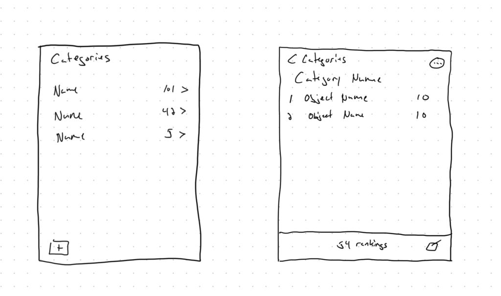
After identifying the basic IA of Rate It, my next step of the process was to sketch out my designs in the shape of wireframes. Wireframes build upon the IA and determine what will exist on the screen and where it will be positioned on the screen.
There are several different wireframing tools, although I find simply putting pen to paper to be the least disruptive to the creative process. This way I am not constrained by a tool. When I am sketching something out, I will typically use my iPad and use some type of infinite canvas such as Apple’s Freeform. The fidelity of these sketches is very low, but they allow me to iterate quickly and simply identify the proper path for the high-fidelity mockups.
Design System
Before embarking on the creation of the high-fidelity mockups, I take one additional step in the process that helps expedite the creation of the mockups. That step is establishing the design system. A design system is the overarching standards and guidelines that will be used throughout the product. It will consist of an extraction of reused components and highlights the branding.
When building out the design system, I will build it in the tool where my high-fidelity mockups will live so I can save the design system and reference it in my actual designs. There are really two standards in the industry: Sketch and Figma. For this project, I used Figma since it has a free plan I was able to utilize.
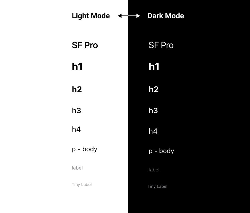
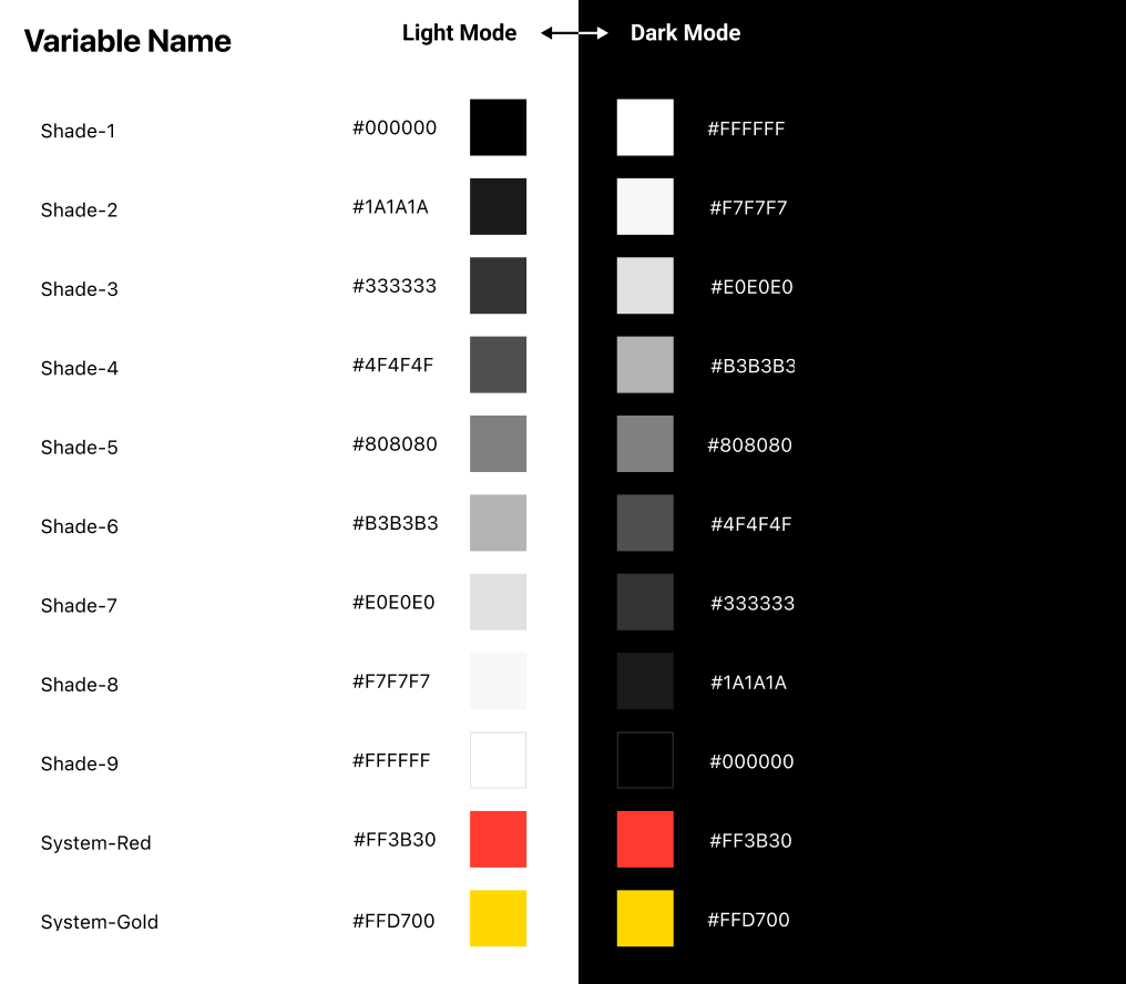
In my design system, I determined the typography, colors, and icon usage that would be used throughout the app. I knew I wanted to have a light and dark version so I laid out what each would look like and simply inverted the greyscale colors between the two. I find having nine different shades provides enough flexibility for different use cases. As for the fonts, I determined font family, font size for different header tags, and even font color.
Designing the Actual Screens
Now that I have established my IA, put together some wireframes, and laid out my design system, I was finally able to work on the final step, creating the high-fidelity designs. My goal for the designs was to be absolutely pixel-perfect so they could be used for the actual development of the screens. During the process, I made sure to be specific on spacing, alignment, sizing, and color. I also wanted to make sure I captured every interaction of the process, making sure nothing was assumed. This meant going through all states such as reading, creating, editing, and deleting.
Below is a screenshot of a few screens from my Figma designs. I started with the blank state a user sees when they first open the app with no categories. I then built out the remaining screens for the category-creation flow. The first screen in the category-creation flow is the blank state for a new category, followed by the interaction details for editing the category icon.
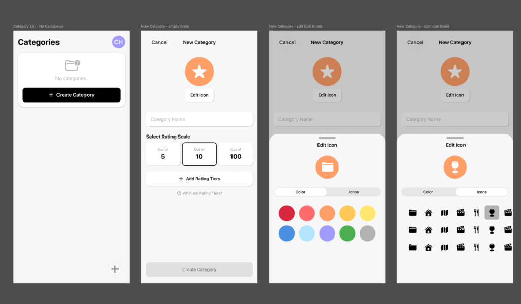
To iterate through the different interactions in the user flow, I duplicated the prior screen and then made the adjustments to the new screen. When creating the first base screen, I made sure I identified shared components. Then I either pulled them from the design system or if they did not exist, I added them to the design system.
A pro tip when using Figma or Sketch is to create the shared components as either Components in Figma or Symbols in Sketch so the component can be maintained in one place and any changes made to the source will propagate to all references.
After completing the create category flow, I then proceeded along the user journey and created a version of the category list with the newly created category. The creation of the category then led naturally to the next step in the user journey — seeing ratings within the category. I progressed through the same sequence as I did with the category list screen, and I designed the flow for adding a new rating. I repeated this process until every interaction was accounted for and every flow had a closed loop.
Now that the designs were completed and all interactions and flows were accounted for, I could start the actual development of the app. The design process can be cumbersome and time-consuming. However, it is far less time-consuming than sifting through the interaction gaps during the actual development process. Iterating through designs is much quicker and easier than discovering them mid-build and reworking actual code.